
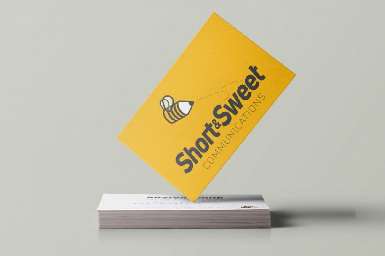


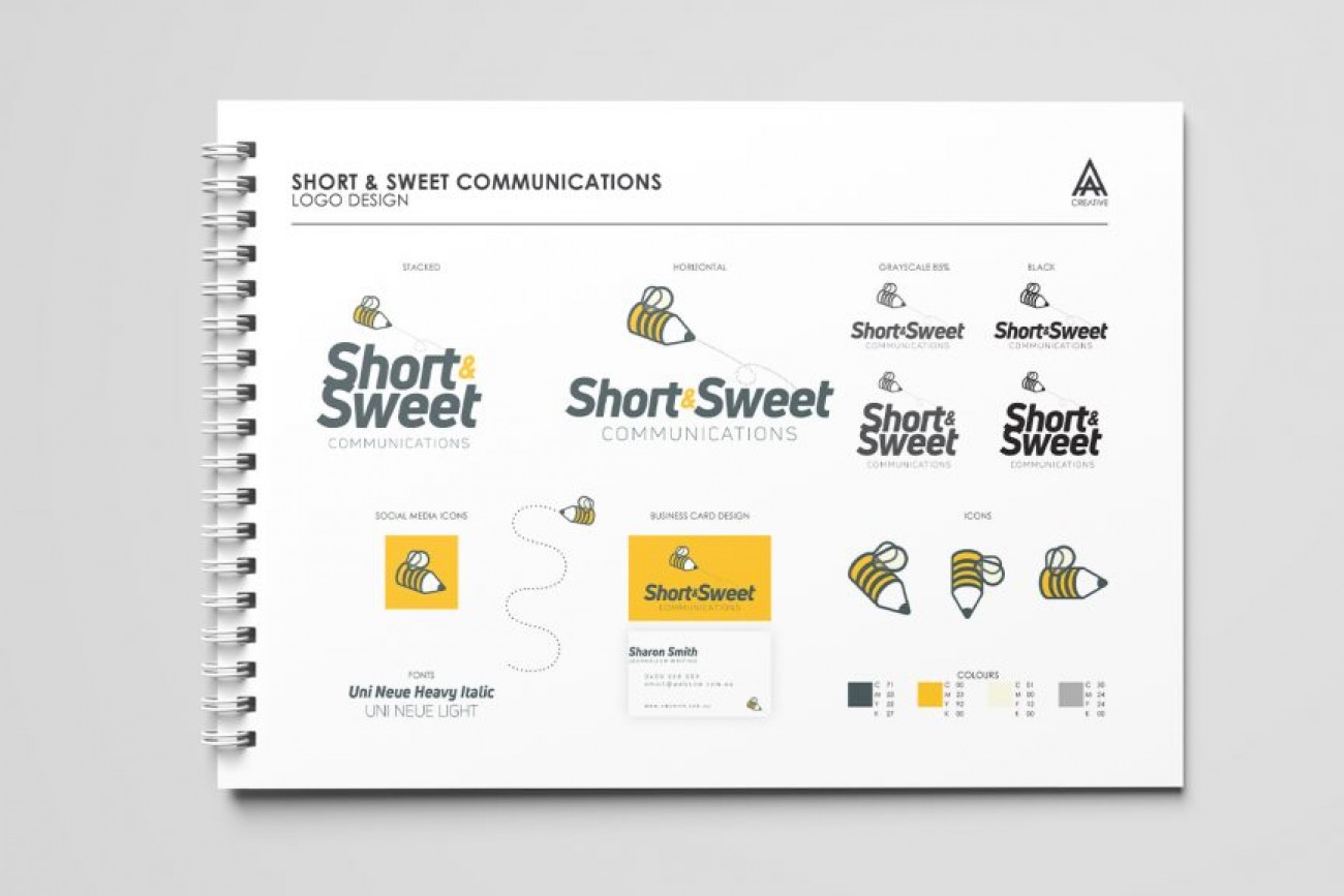
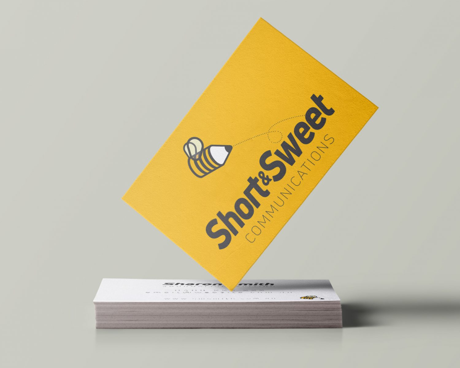
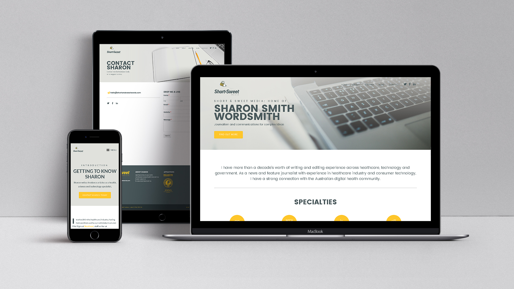
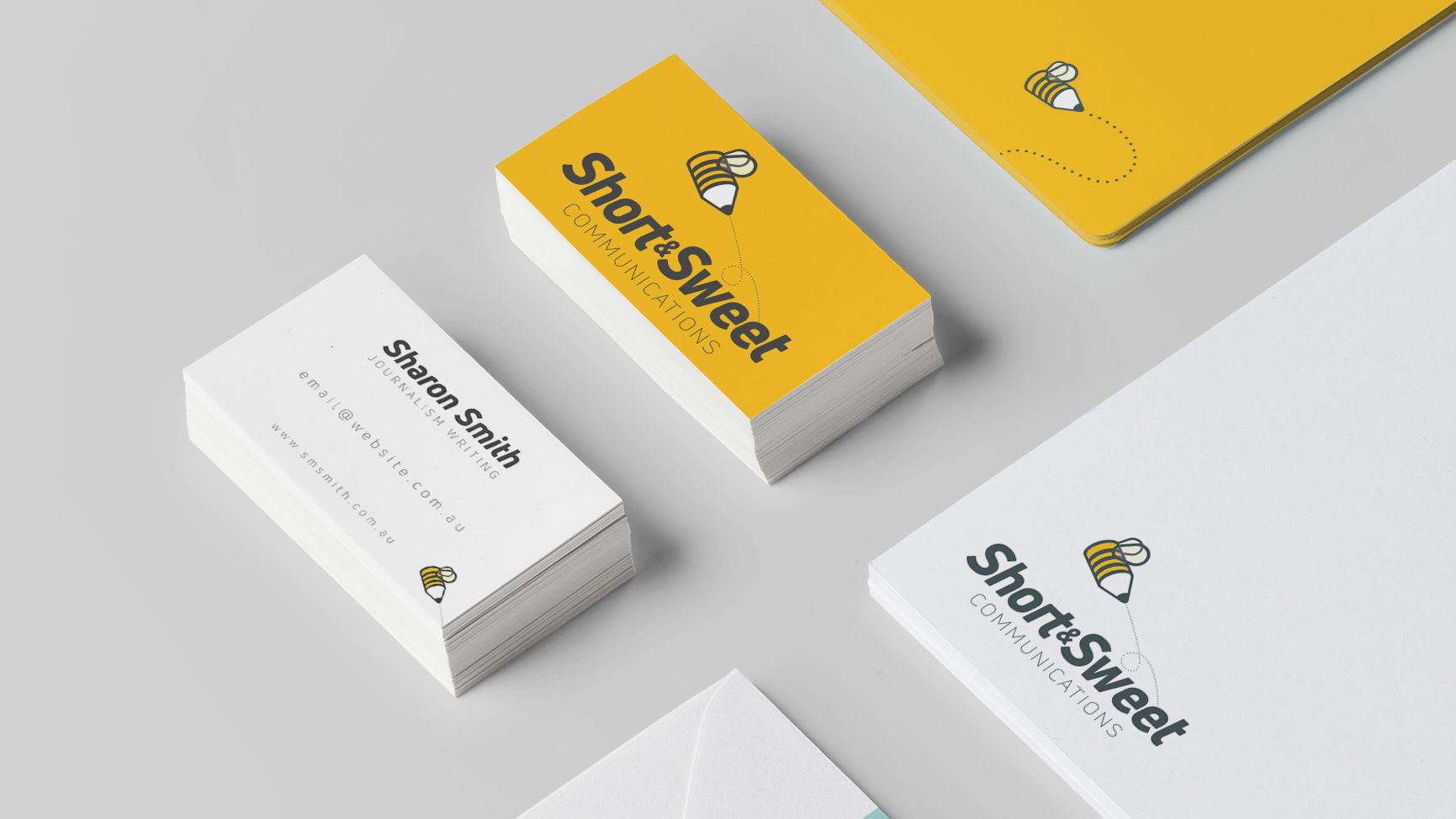
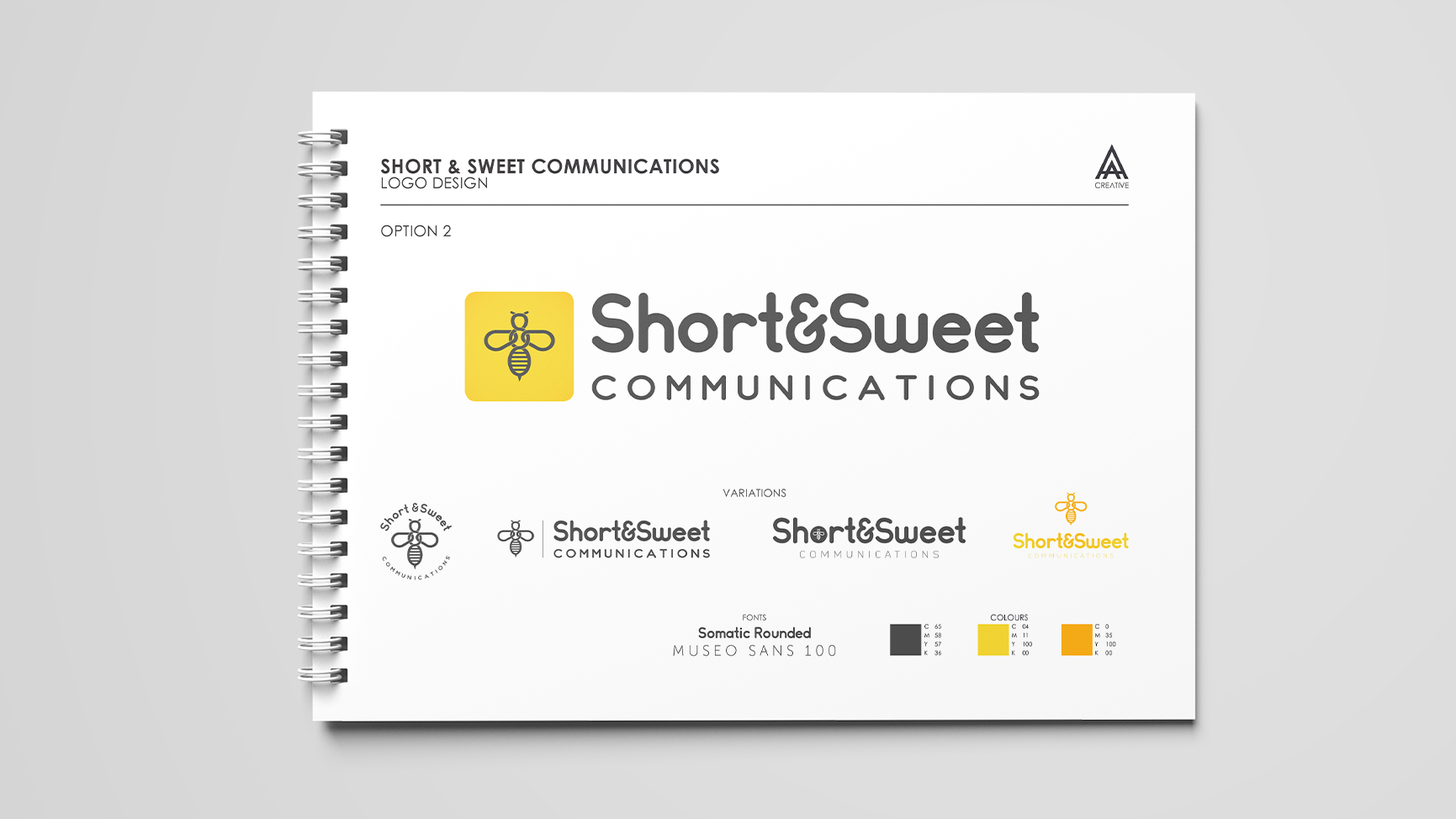
SHORT & SWEET COMMUNICATIONS
Double A Creative was approached by a healthcare and technology journalist who required branding for their content, marketing and editing business.
The idea was to create a fun and simple logo for the branding of a business that focuses on the very complex topics of healthcare and science but delivers for a broad audience. In a week, Double A Creative had developed 3 concepts, 3 directions that shared the idea of simplicity for Short & Sweet Communications. After a few email conversations back and forth, we refined the initial concepts and we worked together to finalise the “Bee” icon (called HBee), the colour palette, style, formatting and font. Very proud of this one, not only because of the end results but also because of the process.
TESTIMONIAL
“I am delighted with the branding Double A Creative produced for my new company. They listened to my needs, provided guidance when needed, and the concepts they delivered perfectly captured the personality of my business and my and desired customer base.“
Sharon Smith
Owner, Short & Sweet Communications
PROJECT OUTLINES: Marketing / Branding / Graphic Design / Website

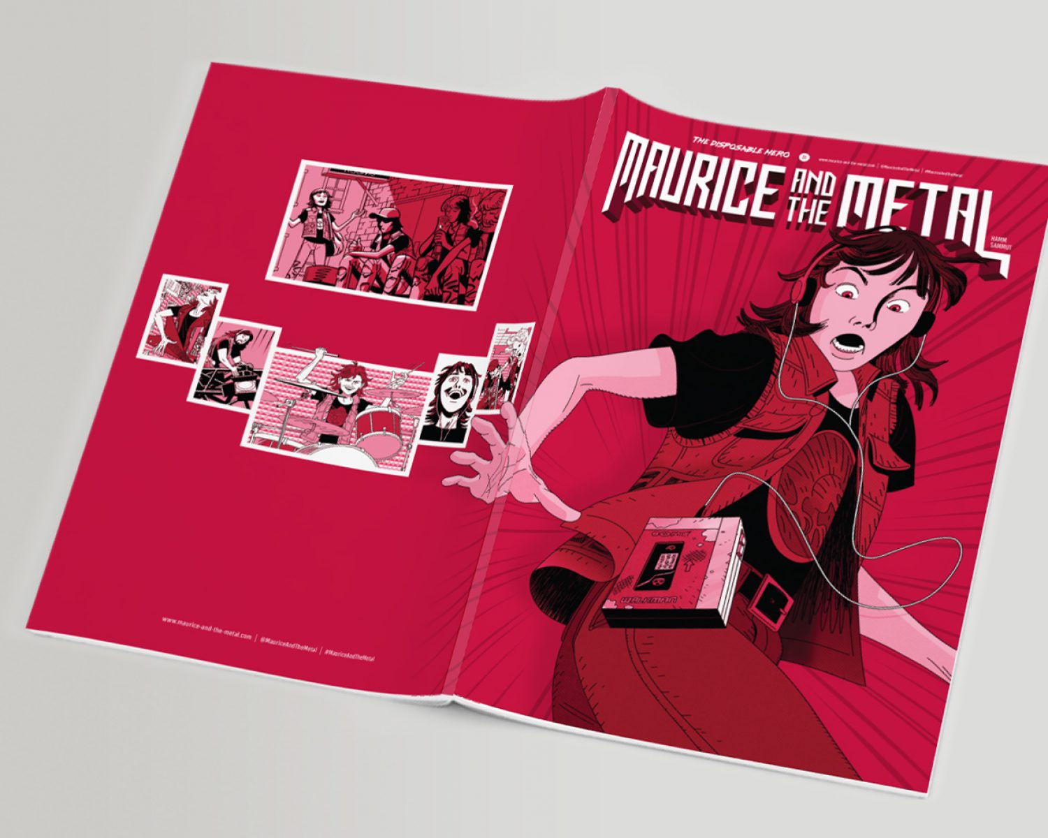
MAURICE & THE METAL
GRAPHIC DESIGN, MARKETING, PUBLISHING, VIDEO, WEB DEVELOPMENT-
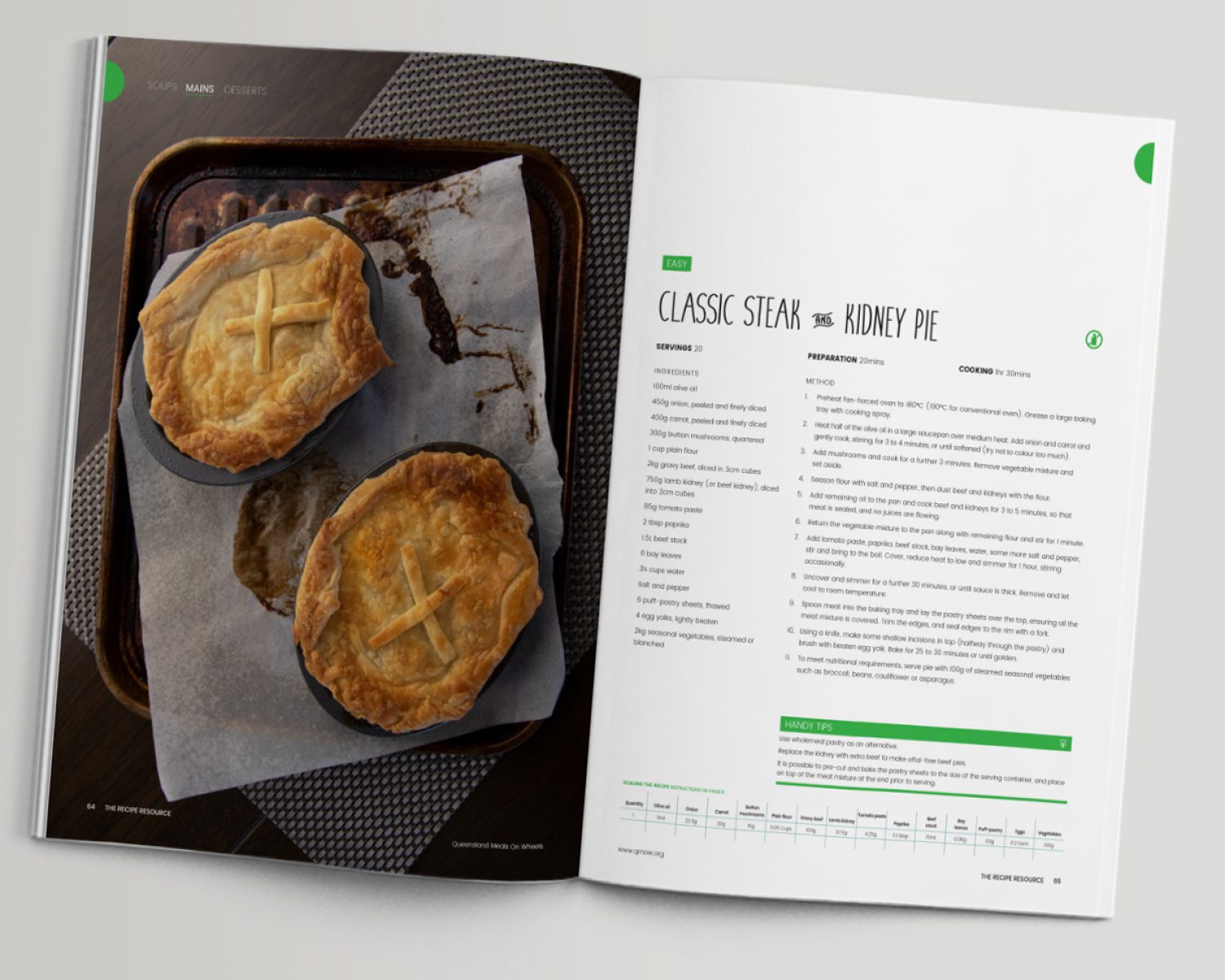
QUEENSLAND MEALS ON WHEELS – Recipe Resource
ADVERTISING, GRAPHIC DESIGN, MARKETING, PHOTOGRAPHY -
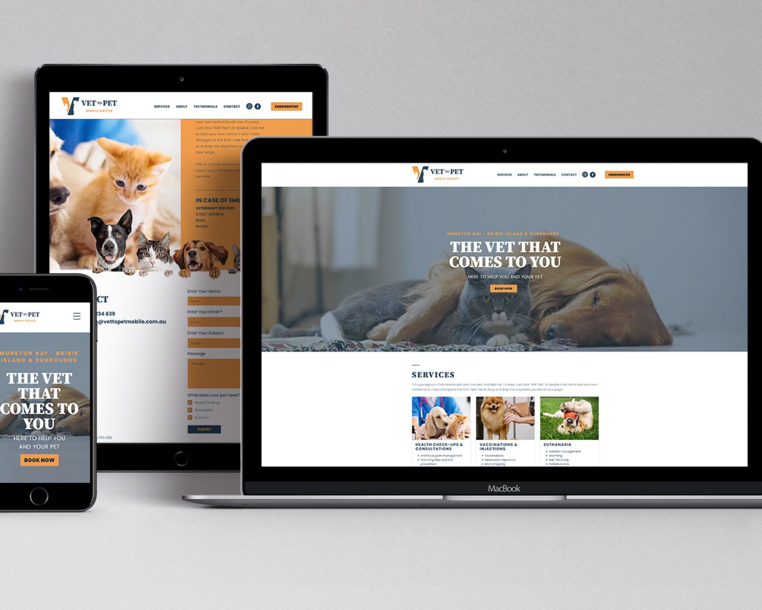
VET TO PET – Mobile Services
ADVERTISING, BRANDING, GRAPHIC DESIGN, MARKETING, WEB DEVELOPMENT -
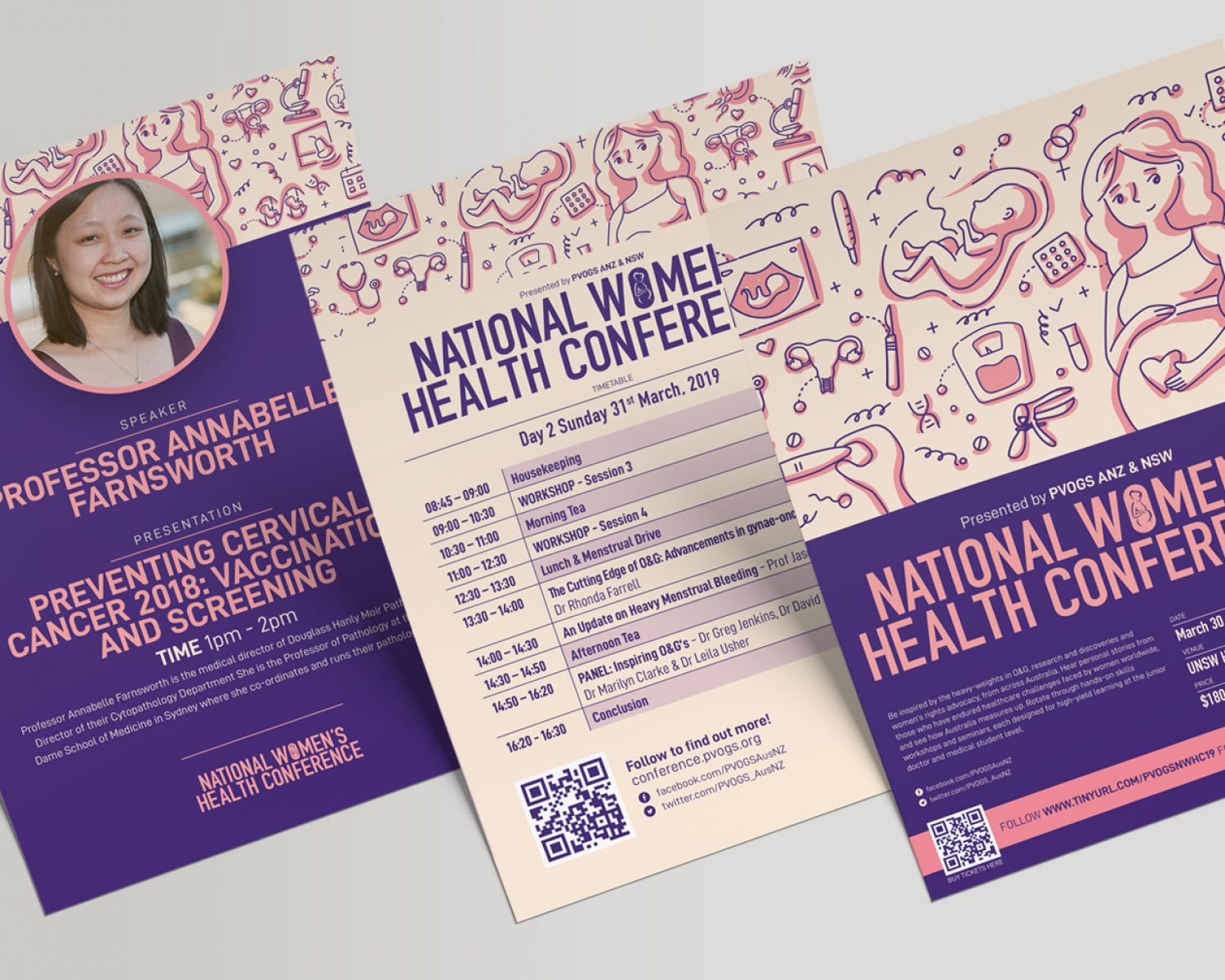
PVOGS – Pre-Vocational Obstetrics & Gynaecology Society
ADVERTISING, BRANDING, GRAPHIC DESIGN, MARKETING -
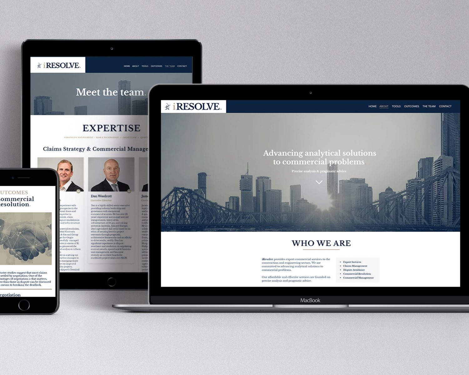
iRESOLVE
ADVERTISING, BRANDING, GRAPHIC DESIGN, MARKETING, PHOTOGRAPHY, WEB DEVELOPMENT -
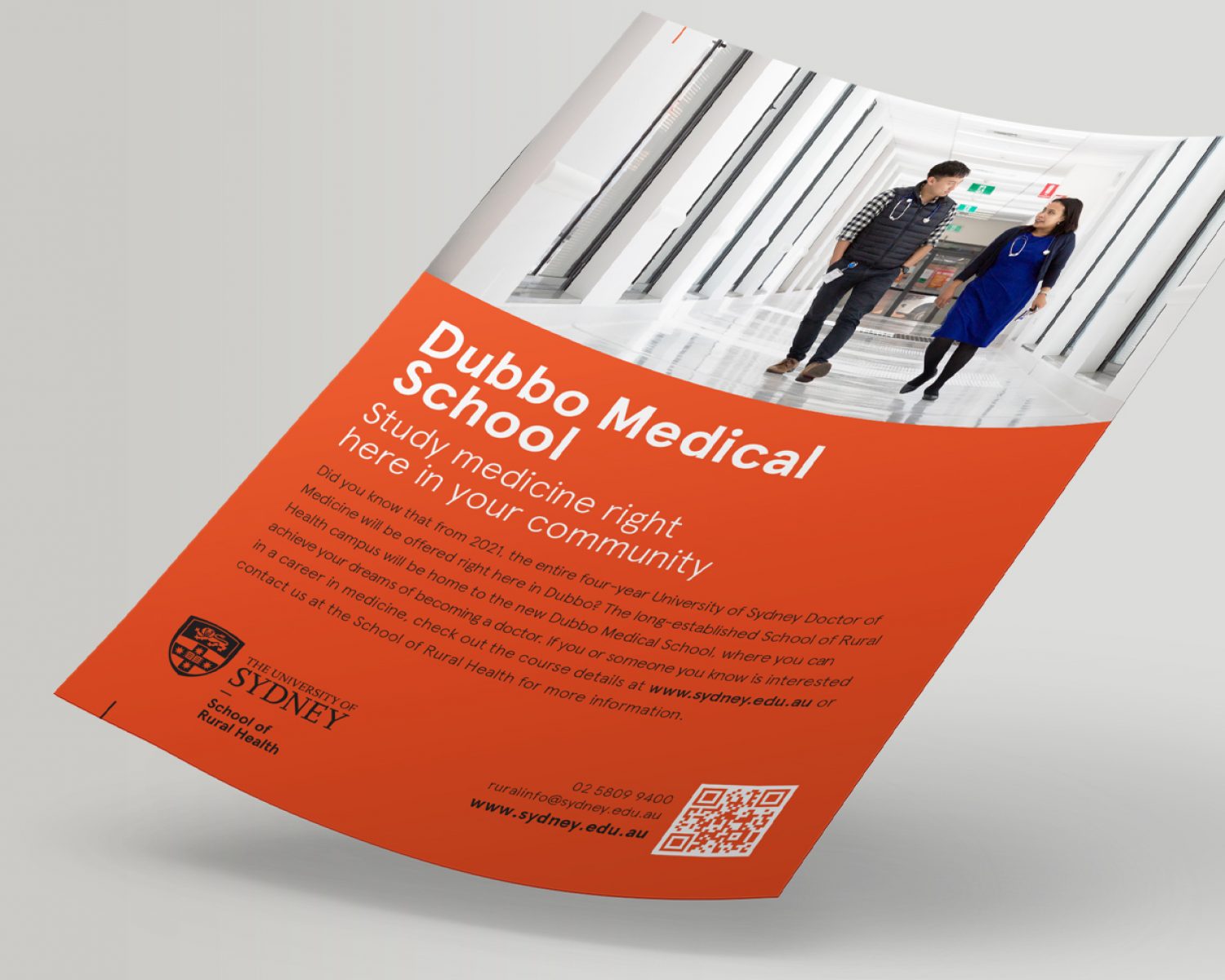
THE UNIVERSITY OF SYDNEY – School of Rural Health
ADVERTISING, GRAPHIC DESIGN, MARKETING -
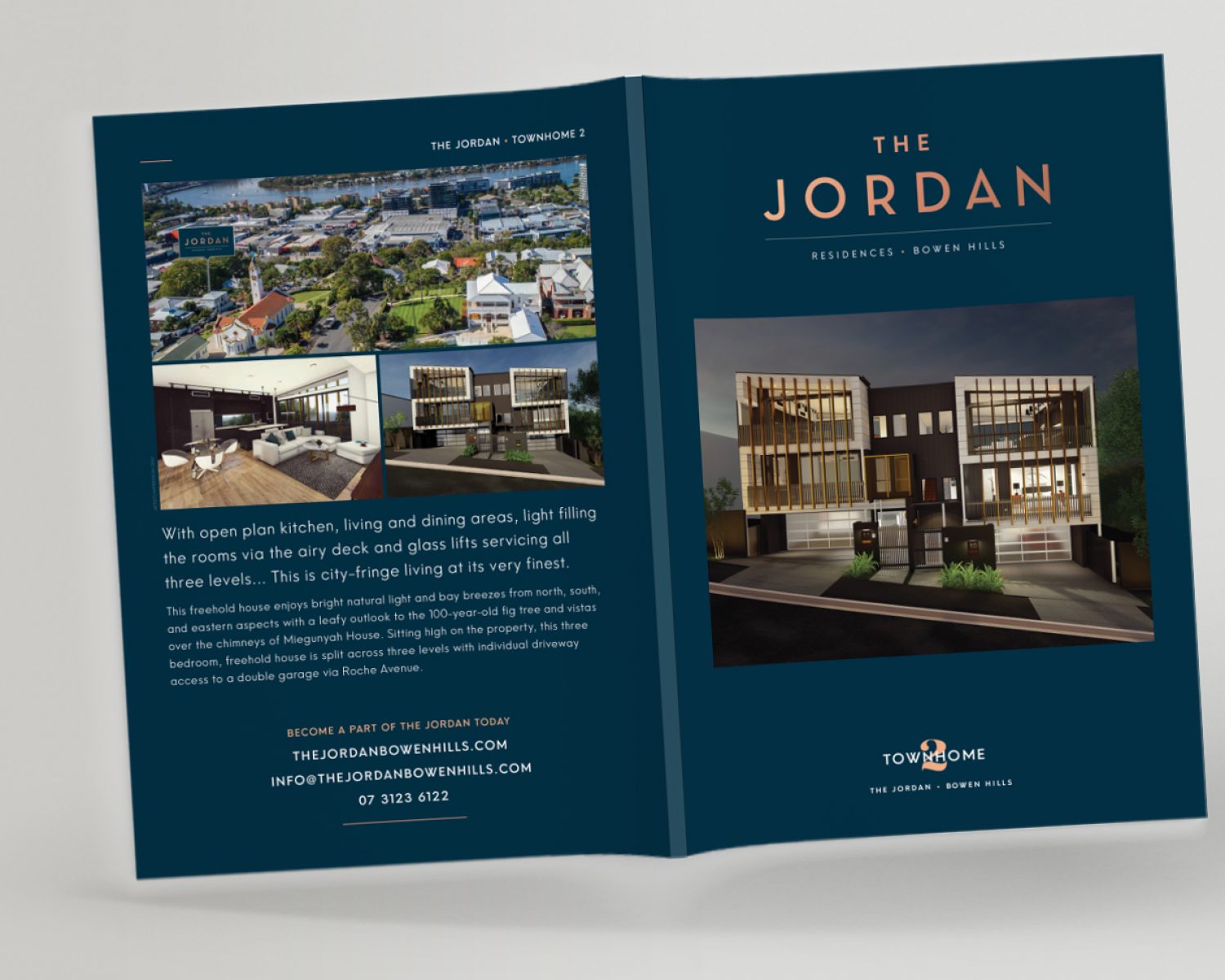
THE JORDAN – Bowen Hills
GRAPHIC DESIGN, MARKETING, PRODUCT CATALOGUE -
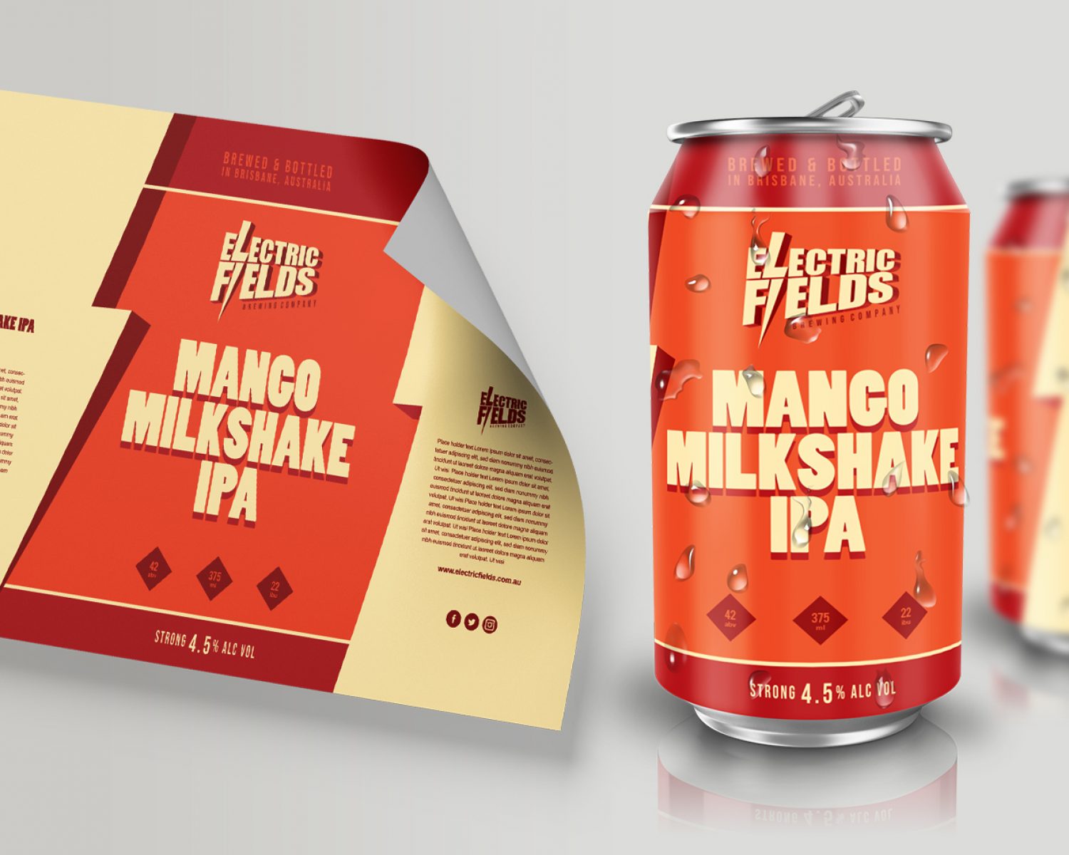
ELECTRIC FIELDS BREWING CO
BRANDING, GRAPHIC DESIGN, MARKETING -
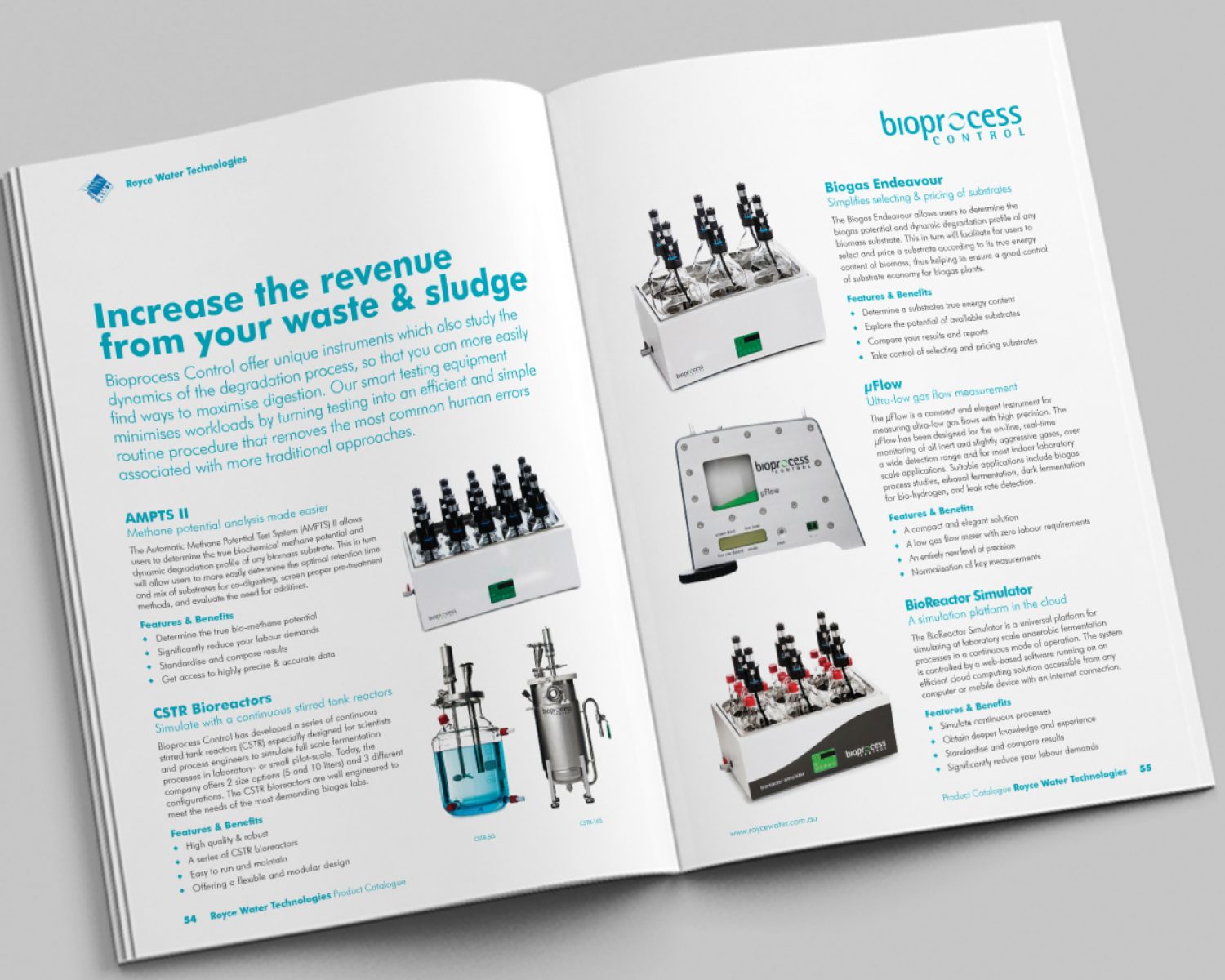
ROYCE WATER TECHNOLOGY
GRAPHIC DESIGN, MARKETING -
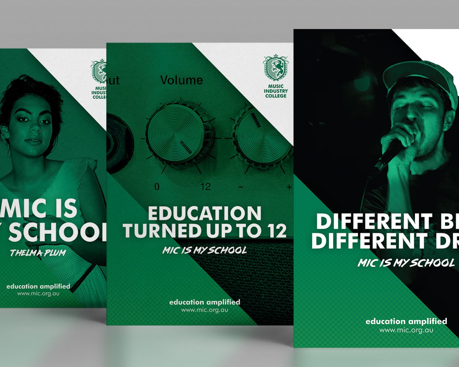
MUSIC INDUSTRY COLLEGE
ADVERTISING, BRANDING, GRAPHIC DESIGN, MARKETING -
SHORT & SWEET COMMUNICATIONS
BRANDING, GRAPHIC DESIGN, WEB DEVELOPMENT -
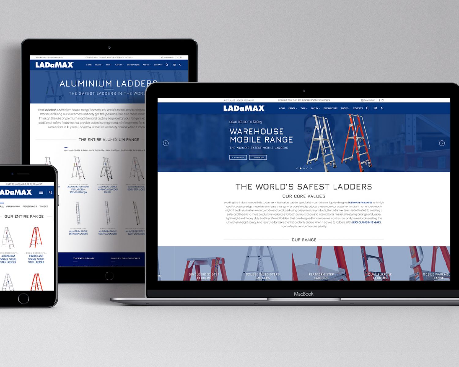
LADAMAX
BRANDING, GRAPHIC DESIGN, MARKETING, PRODUCT CATALOGUE, WEB DEVELOPMENT -
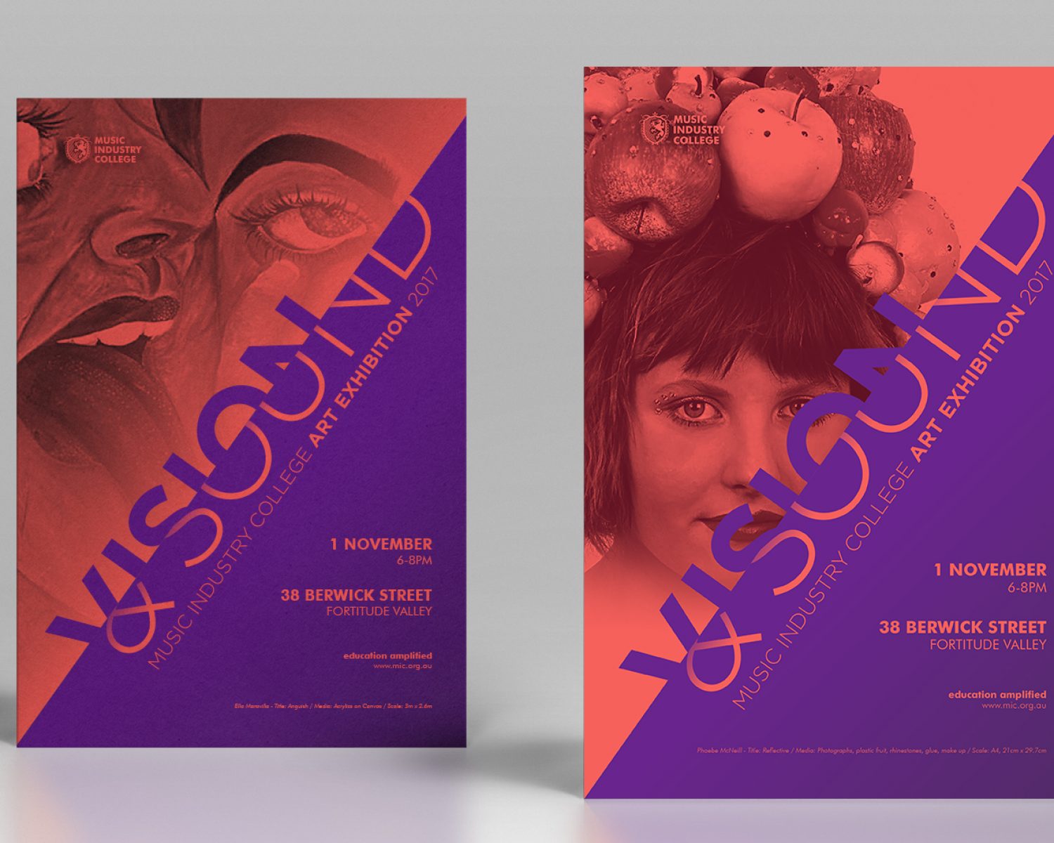
VISION & SOUND EXHIBITION
ADVERTISING, BRANDING, GRAPHIC DESIGN, MARKETING -
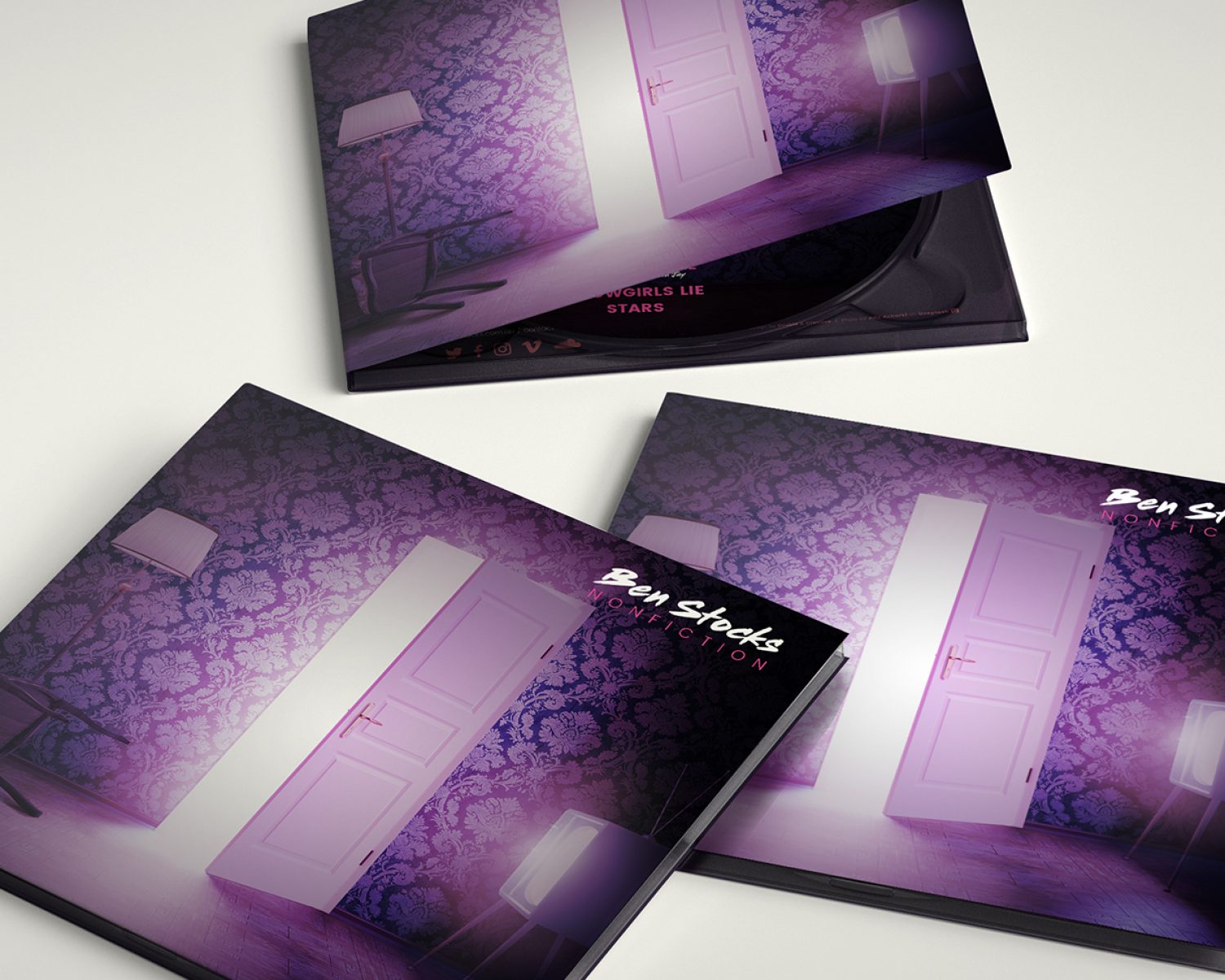
BEN STOCKS
GRAPHIC DESIGN -
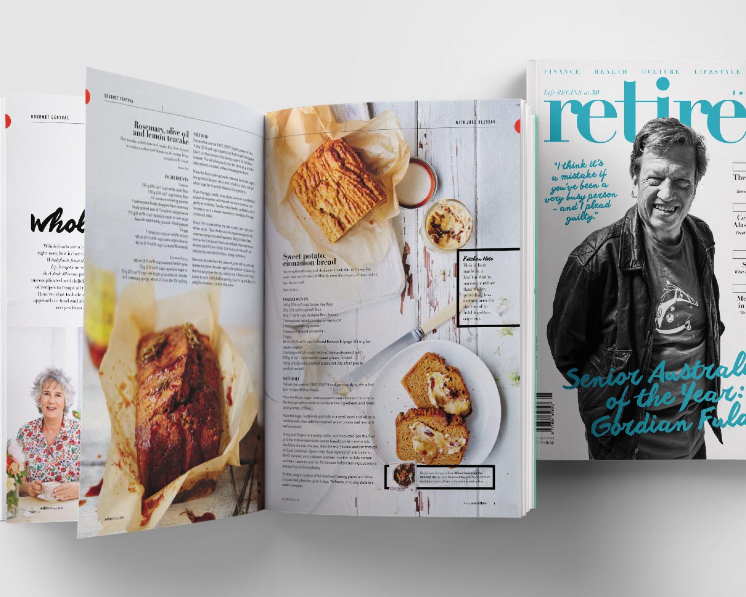
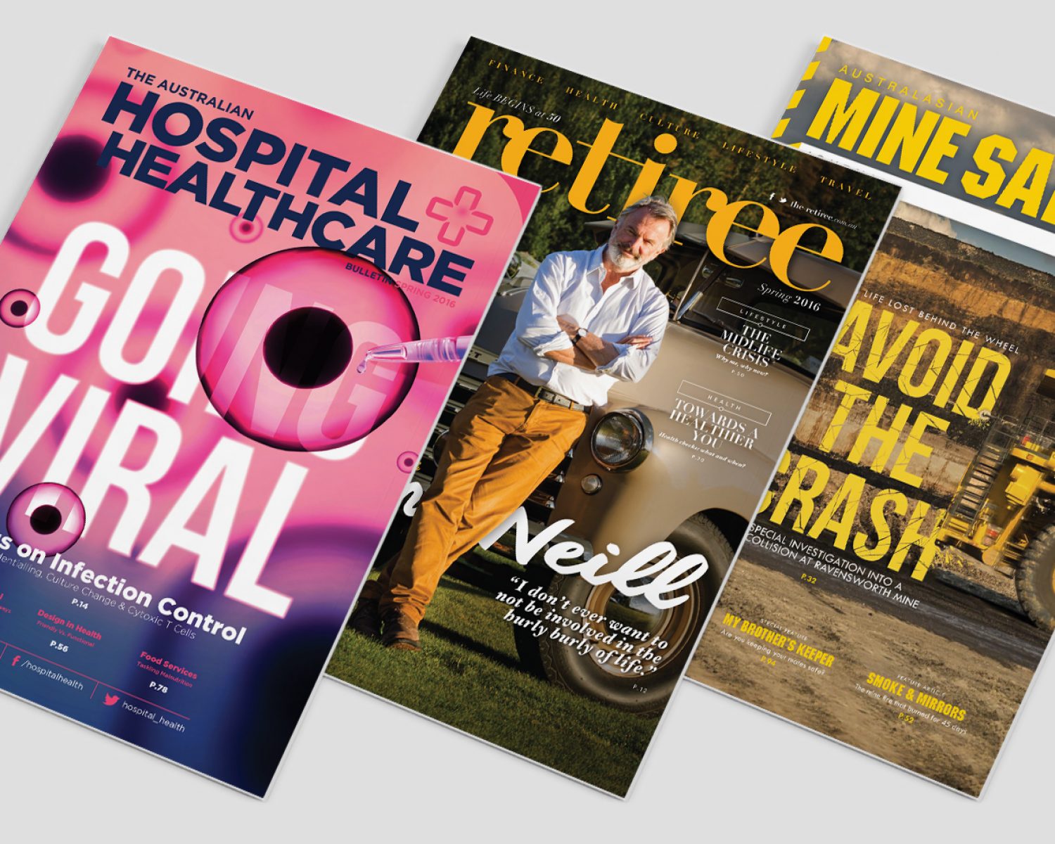
THE RETIREE MAGAZINE
BRANDING, GRAPHIC DESIGN, PUBLISHING -
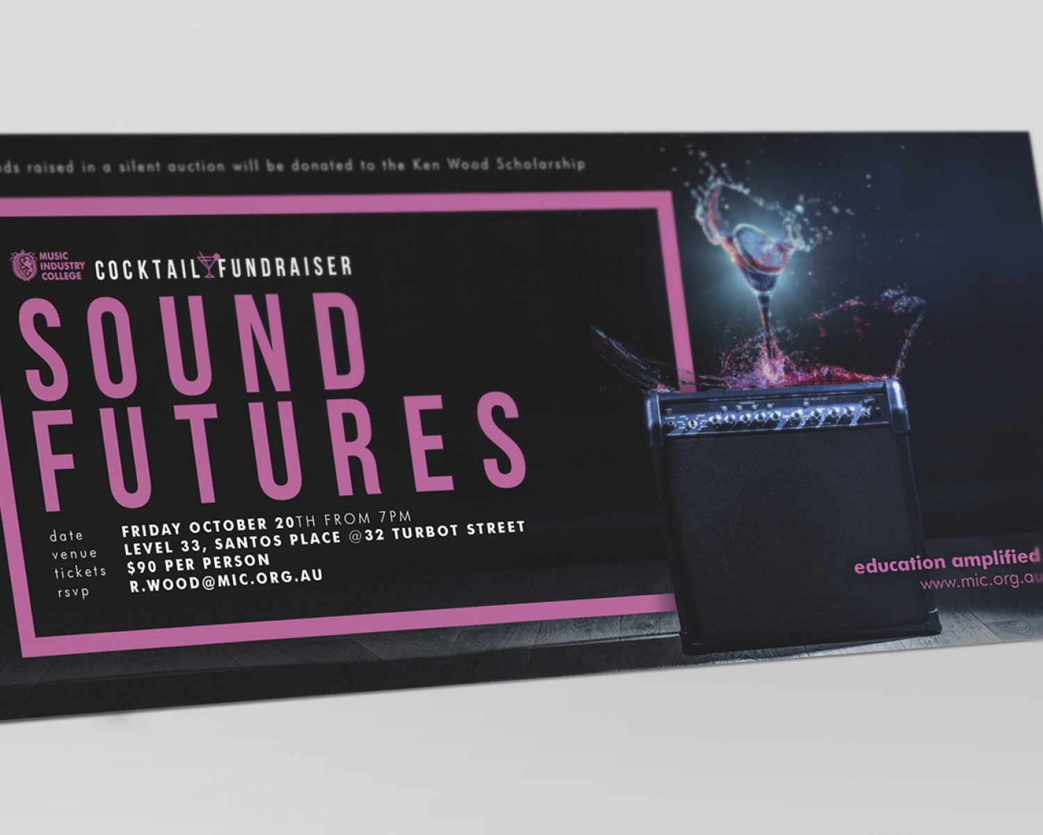
SOUND FUTURES / COCKTAILS FOR A CAUSE
ADVERTISING, GRAPHIC DESIGN, MARKETING -
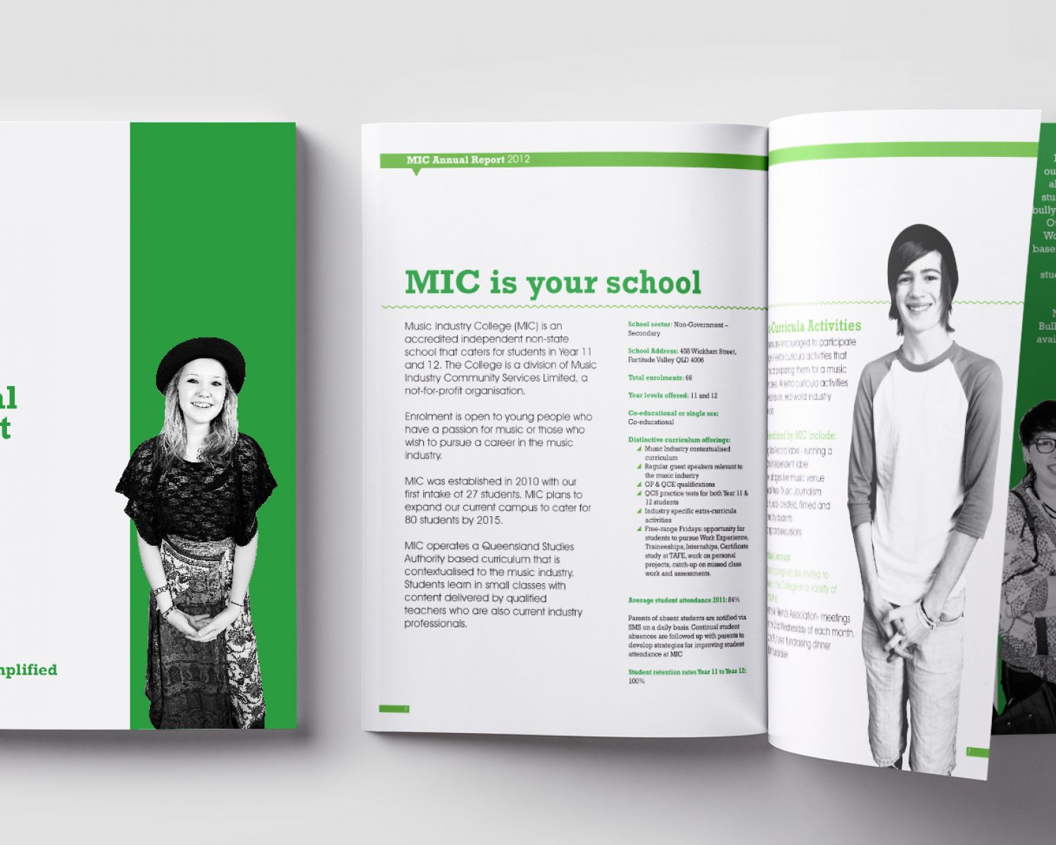
MUSIC INDUSTRY COLLEGE
ANNUAL REPORT, BRANDING, GRAPHIC DESIGN -
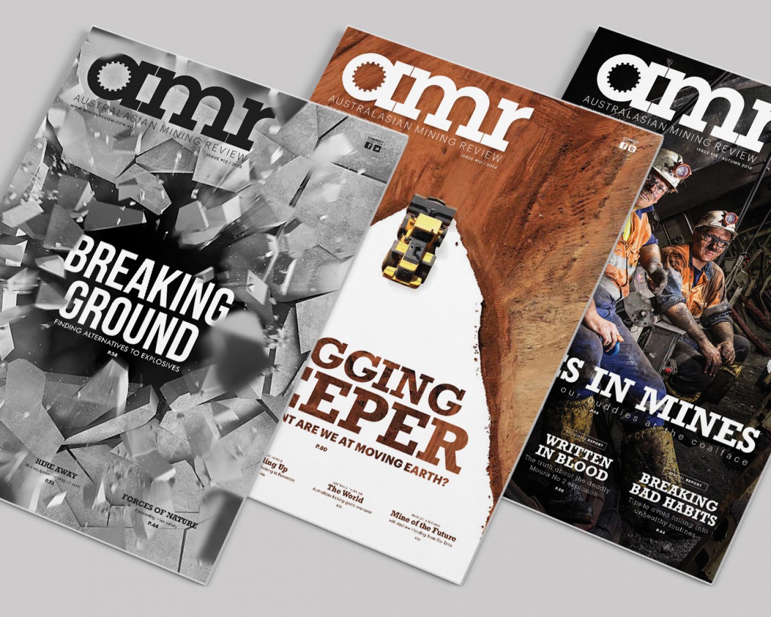
AUSTRALASIAN MINING REVIEW
BRANDING, EDITORIAL, GRAPHIC DESIGN, PUBLISHING -
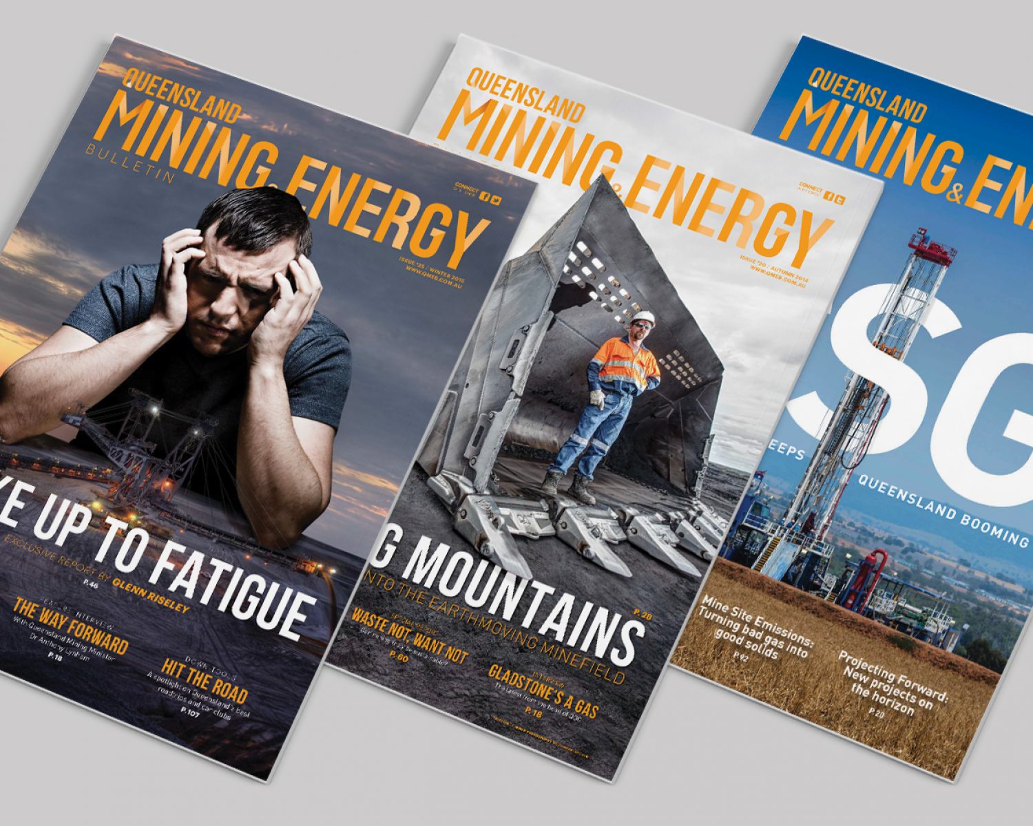
QUEENSLAND MINING AND ENERGY BULLETIN
BRANDING, EDITORIAL, GRAPHIC DESIGN, PUBLISHING -
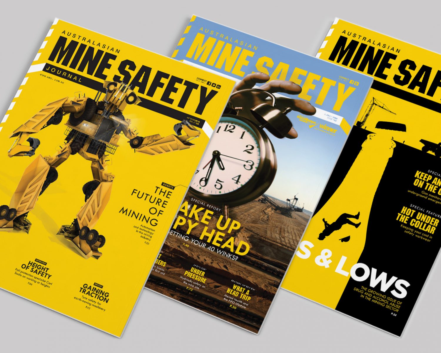
AUSTRALASIAN MINE SAFETY JOURNAL
BRANDING, EDITORIAL, GRAPHIC DESIGN, PUBLISHING -
PIXELHUNT
BRANDING, GRAPHIC DESIGN, PUBLISHING -
APRS MEDIA
BRANDING, EDITORIAL, GRAPHIC DESIGN, PUBLISHING -
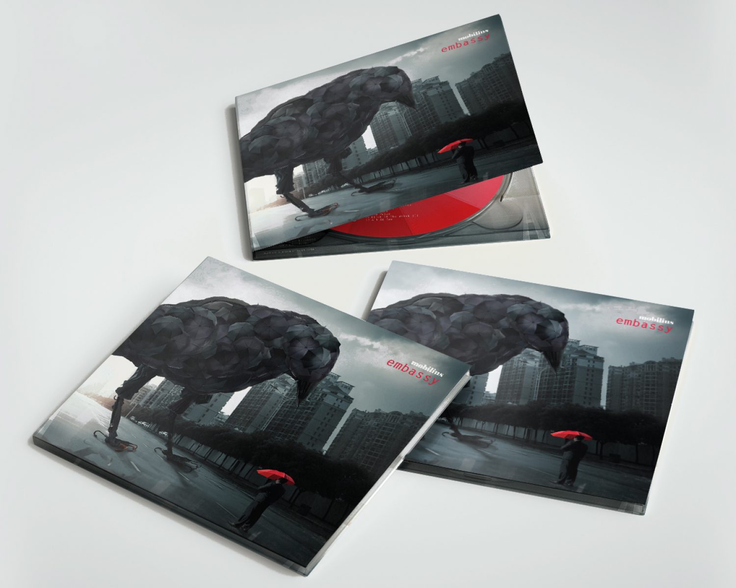
MOBILIUS
BRANDING, GRAPHIC DESIGN, MARKETING, PACKAGE DESIGN -
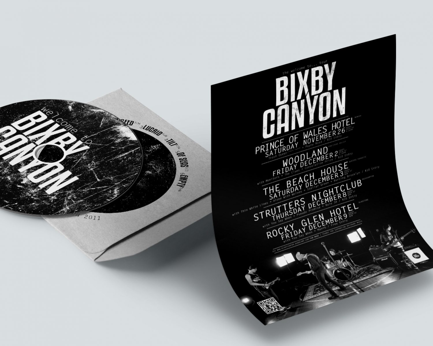
BIXBY CANYON
ADVERTISING, GRAPHIC DESIGN, MARKETING -
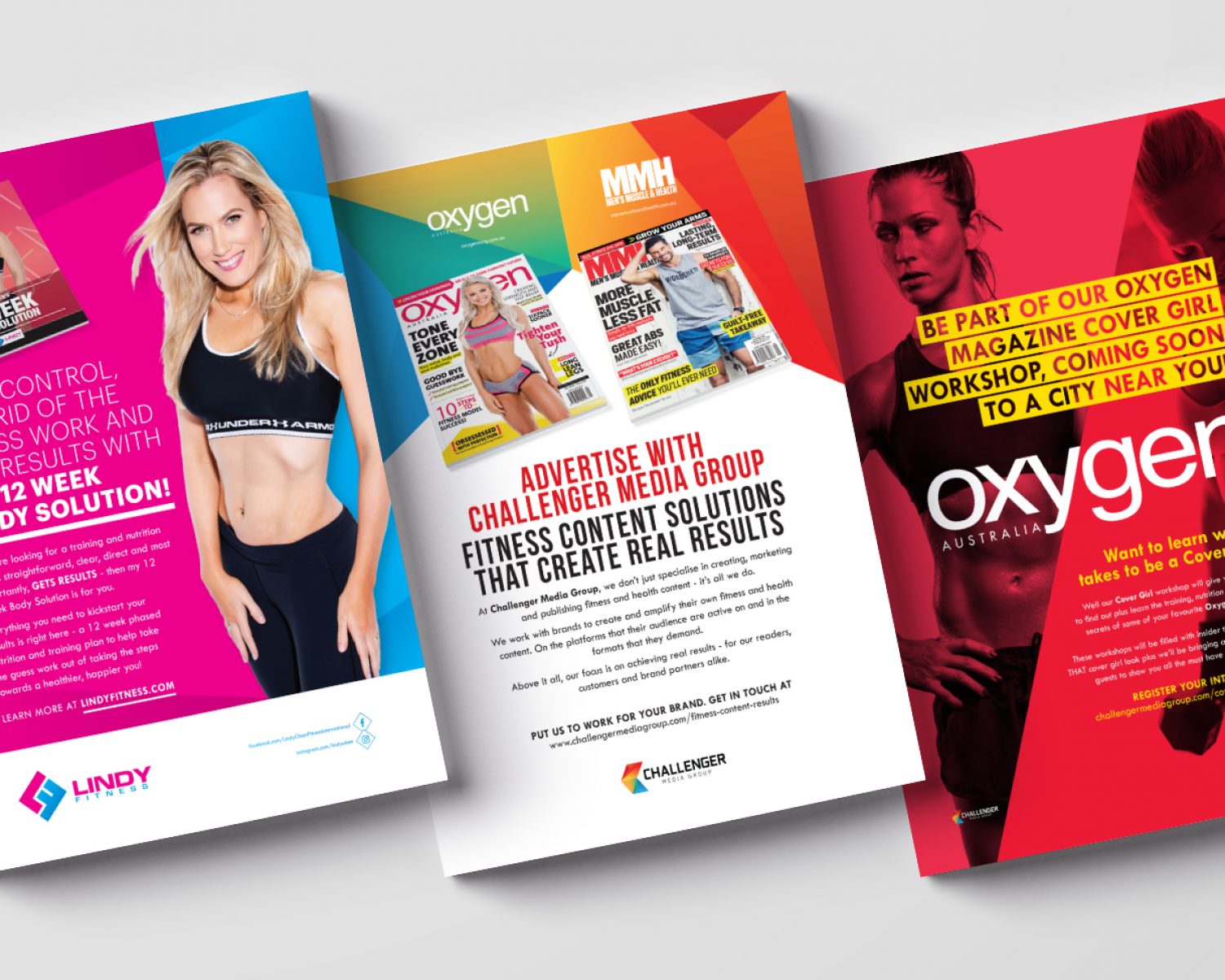
CHALLENGER MEDIA GROUP
ADVERTISING, GRAPHIC DESIGN, MARKETING -
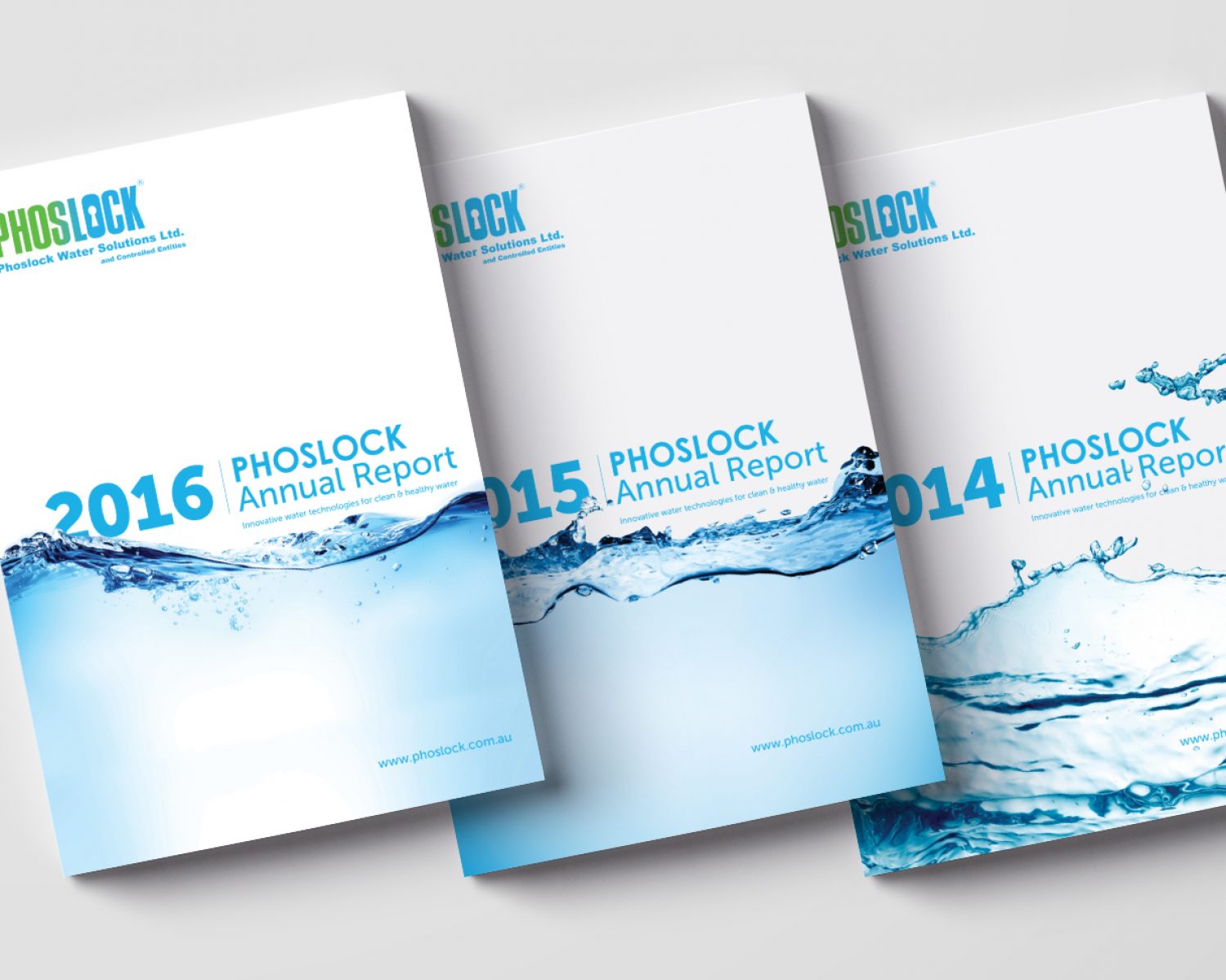
PHOSLOCK
ANNUAL REPORT, GRAPHIC DESIGN, MARKETING -
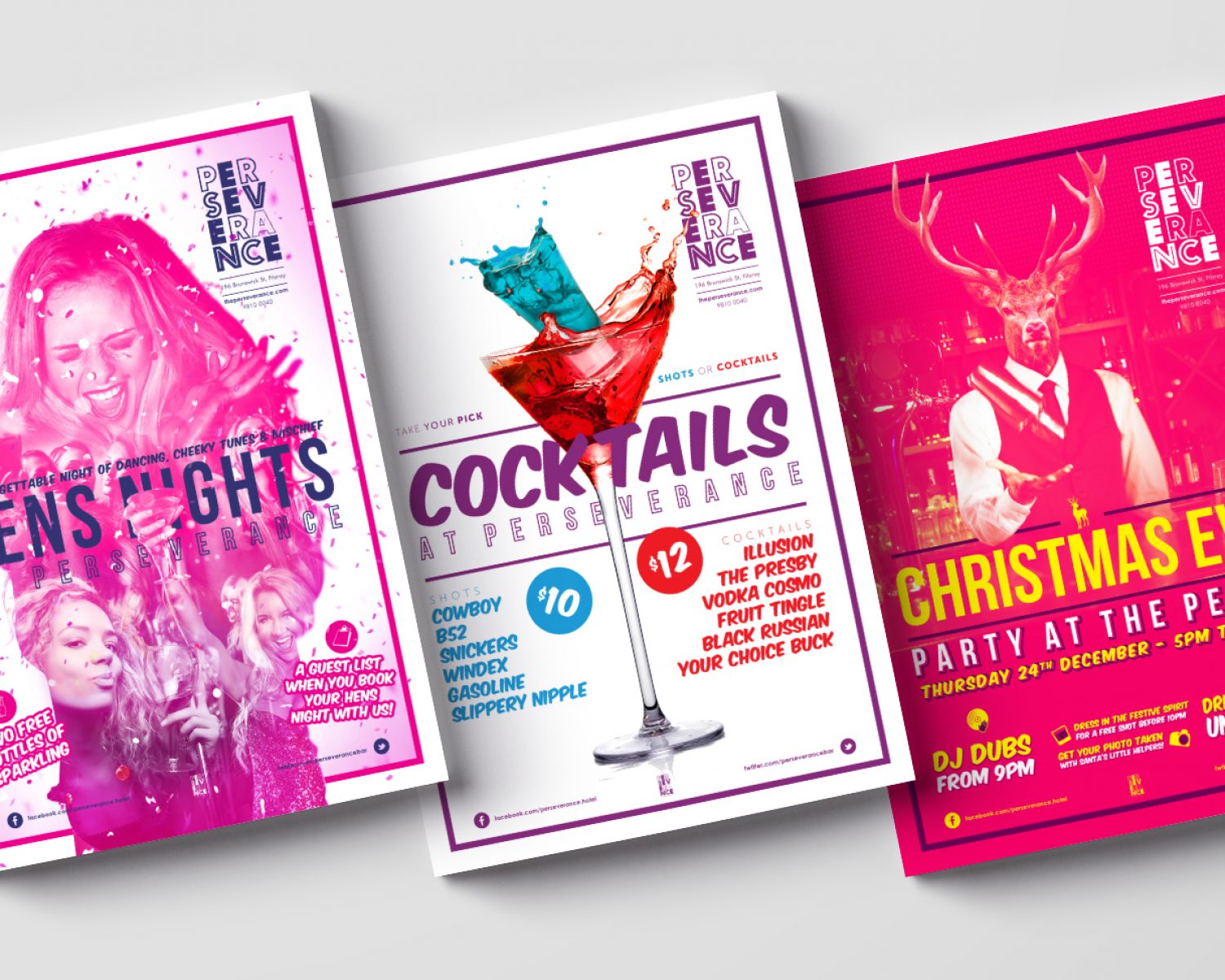
DIXON HOSPITALITY
ADVERTISING, GRAPHIC DESIGN, MARKETING -
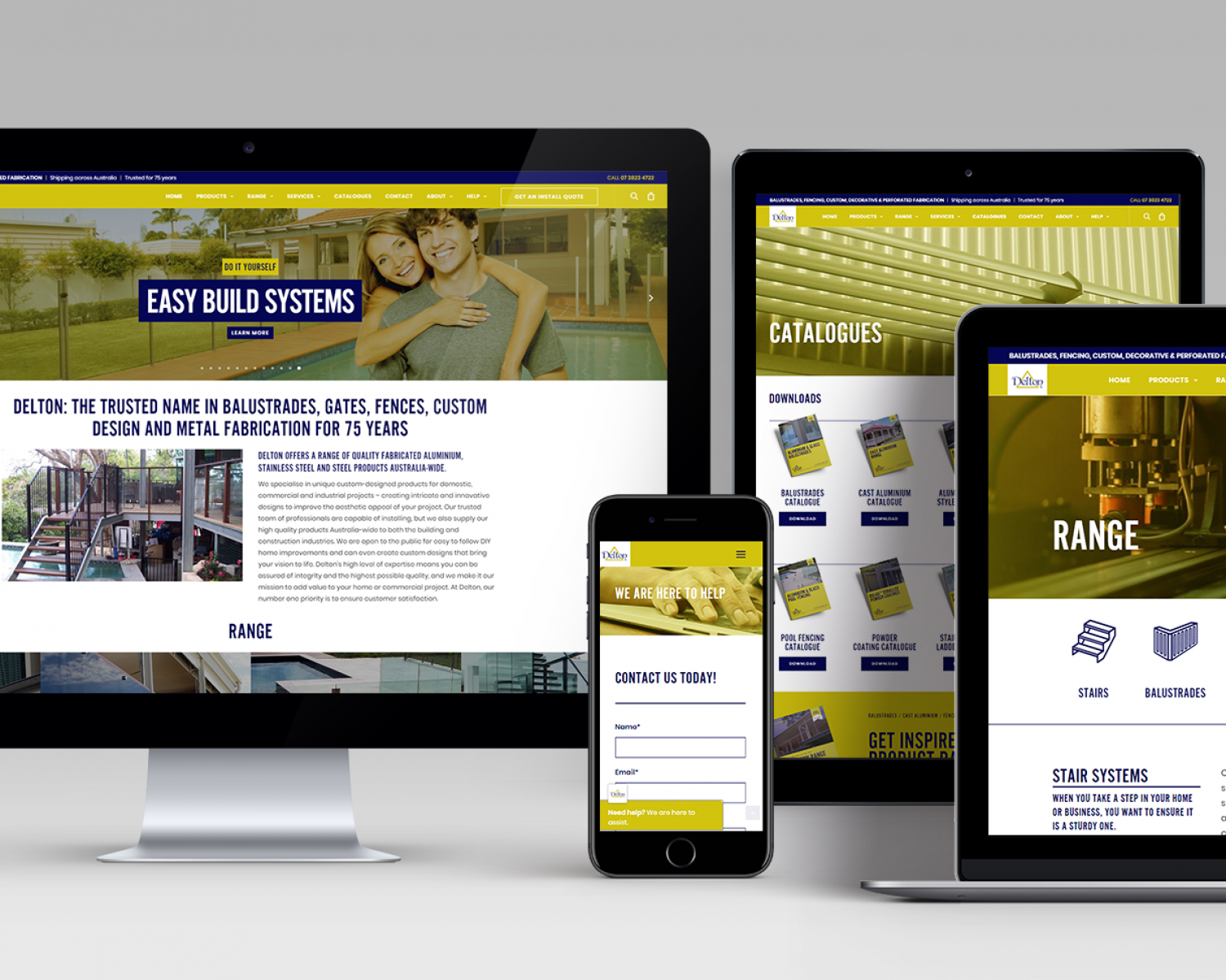
DELTON INDUSTRIES
GRAPHIC DESIGN, MARKETING, WEB DEVELOPMENT
-
MAURICE & THE METAL
GRAPHIC DESIGN, MARKETING, PUBLISHING, VIDEO, WEB DEVELOPMENT -
QUEENSLAND MEALS ON WHEELS – Recipe Resource
ADVERTISING, GRAPHIC DESIGN, MARKETING, PHOTOGRAPHY -
VET TO PET – Mobile Services
ADVERTISING, BRANDING, GRAPHIC DESIGN, MARKETING, WEB DEVELOPMENT -
PVOGS – Pre-Vocational Obstetrics & Gynaecology Society
ADVERTISING, BRANDING, GRAPHIC DESIGN, MARKETING -
iRESOLVE
ADVERTISING, BRANDING, GRAPHIC DESIGN, MARKETING, PHOTOGRAPHY, WEB DEVELOPMENT -
THE UNIVERSITY OF SYDNEY – School of Rural Health
ADVERTISING, GRAPHIC DESIGN, MARKETING -
THE JORDAN – Bowen Hills
GRAPHIC DESIGN, MARKETING, PRODUCT CATALOGUE -
ELECTRIC FIELDS BREWING CO
BRANDING, GRAPHIC DESIGN, MARKETING -
ROYCE WATER TECHNOLOGY
GRAPHIC DESIGN, MARKETING -
MUSIC INDUSTRY COLLEGE
ADVERTISING, BRANDING, GRAPHIC DESIGN, MARKETING -
SHORT & SWEET COMMUNICATIONS
BRANDING, GRAPHIC DESIGN, WEB DEVELOPMENT -
LADAMAX
BRANDING, GRAPHIC DESIGN, MARKETING, PRODUCT CATALOGUE, WEB DEVELOPMENT -
VISION & SOUND EXHIBITION
ADVERTISING, BRANDING, GRAPHIC DESIGN, MARKETING -
BEN STOCKS
GRAPHIC DESIGN -
THE RETIREE MAGAZINE
BRANDING, GRAPHIC DESIGN, PUBLISHING -
SOUND FUTURES / COCKTAILS FOR A CAUSE
ADVERTISING, GRAPHIC DESIGN, MARKETING -
MUSIC INDUSTRY COLLEGE
ANNUAL REPORT, BRANDING, GRAPHIC DESIGN -
AUSTRALASIAN MINING REVIEW
BRANDING, EDITORIAL, GRAPHIC DESIGN, PUBLISHING -
QUEENSLAND MINING AND ENERGY BULLETIN
BRANDING, EDITORIAL, GRAPHIC DESIGN, PUBLISHING -
AUSTRALASIAN MINE SAFETY JOURNAL
BRANDING, EDITORIAL, GRAPHIC DESIGN, PUBLISHING -
PIXELHUNT
BRANDING, GRAPHIC DESIGN, PUBLISHING -
APRS MEDIA
BRANDING, EDITORIAL, GRAPHIC DESIGN, PUBLISHING -
MOBILIUS
BRANDING, GRAPHIC DESIGN, MARKETING, PACKAGE DESIGN -
BIXBY CANYON
ADVERTISING, GRAPHIC DESIGN, MARKETING -
CHALLENGER MEDIA GROUP
ADVERTISING, GRAPHIC DESIGN, MARKETING -
PHOSLOCK
ANNUAL REPORT, GRAPHIC DESIGN, MARKETING -
DIXON HOSPITALITY
ADVERTISING, GRAPHIC DESIGN, MARKETING -
DELTON INDUSTRIES
GRAPHIC DESIGN, MARKETING, WEB DEVELOPMENT